
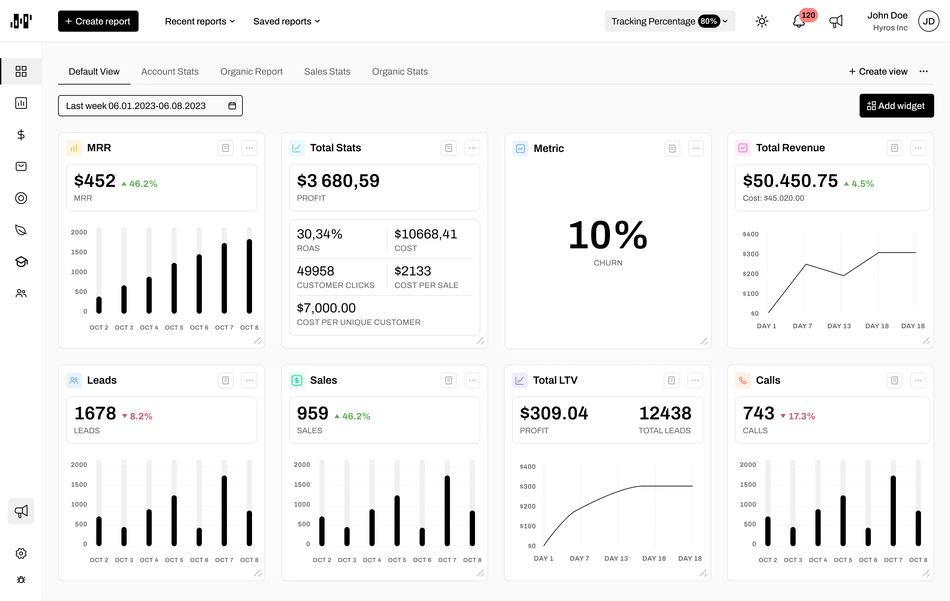
Introducing Our Sleek, Modern Interface Redesign
We’ve refreshed the design to give your browsing experience a cleaner, more refined feel, without compromising on functionality.
Here’s what’s new:
🧼 Minimalist, User-Friendly Interface
The updated layout emphasizes simplicity, reducing visual clutter so you can focus on what matters most. Key actions are now easier to find, and navigation feels more intuitive from the moment you log in.
🌤️ Light Color Scheme
Our new light theme is designed to be gentle on the eyes—perfect for long sessions without strain. Soft contrasts and balanced spacing make for a smooth, visually calming experience.
🔠 Enhanced Typography & Layout
We’ve fine-tuned the font styles and hierarchy to improve readability across all devices. Whether you’re scanning reports or digging into details, everything is clearer, sharper, and easier to digest.
This redesign is more than just a fresh coat of paint—it’s built to make your workflow faster, your navigation smoother, and your overall experience more enjoyable.
👉 Jump in and take it for a spin!