
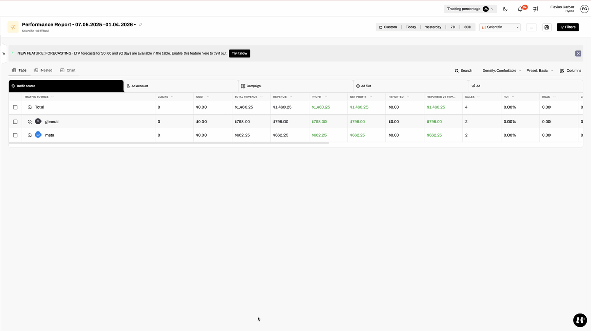
New Performance Report Design & Improved Flow
We’ve redesigned the Performance Report to deliver a cleaner experience, clearer insights, and faster access to what matters most.
What’s new:
Improved layout & readability
The new design simplifies the overall UX flow, making reports easier to scan, understand, and work with—especially when analyzing large datasets.
Faster access to key controls
The report timeframe and attribution model have been moved to the top navigation bar for quick access. For deeper customization, advanced options are still available via the Filters panel.
New Chart tab
We’ve introduced a dedicated Chart tab and moved all visualizations there, while keeping the Tabs view as the default for data exploration. This creates a clearer separation between charts and tables.
Table density controls
You can now switch between Compact, Comfortable, and Large table densities, allowing you to optimize the view based on your screen size and analysis needs.
This update makes the Performance Report more flexible, easier to navigate, and better suited for both quick checks and deep analysis.